Steven Curtis
I was an artist from childhood. I started work in Photography in my early 20s, and ended up in Film School in Chicago in the late 80s. Graduating with a degree in film did not necessarily mean I was in the film industry. Rather, that degree took me other places, specifically within the realm of computers, animation, audio production, and other artistic endeavors. I’ve owned a video production business for awhile, and made mostly corporate style commercials and special FX pieces and animations for clients. But as time has gone on, I’ve come full circle around to the more pure forms of art again, in particular oil paintings, and illustration, and on a very old and prototypical form of substrata; wood.
I've completed 103 works now since the first 2 in 2013. I was I’ve produced more than 85 paintings (2022)(and now updated in July 2023 to just over 100), currently at work at any given time on at least 4 in rotation, allowing for drying while I work with the others. I started large, and have gone more towards medium and small sizes, with plans for larger ones still in the works. I have produced 1 triptych as well, my first and only one so far.
I have never been stressed out about being famous, or rich. Not many who become artists truthfully believe we will be one or either of these things when we launch into art as a profession, unless we are under some delusion.
My motivation is one piece of art at a time and knowing that it has accomplished my goal, which is meaningful impact, or lasting impression if you wish. I hope you, and the rest of the world, in so much as they can be reached with it, will enjoy my art, but also wrestle with it. There is a part of me that goes into every piece.
For models and subject matter I’ve worked primarily from photos, sometimes my own, getting permission from other photographers, or the huge amount of images that are free online. Photos at least stay put for you and the light does not change. I’ve tried Plein Air, and I do like it. The rest of my work is much more carefully planned and crafted, purposeful, and normally smooth, utilizing a great deal of blending at every stage. Even with multiple layers of paint you can still see the wood grain to some degree, or the strokes of the application of gesso.
I create my own frames, or reform choice “found” ones, and so I’ve become quite the woodworker, out of that necessity. Most of my pieces are custom-framed and hand-stained for color and fit.
I'm making a stab at adding Surrealism to my styles. I now have pieces like Oligarch, and today (09/22/22), I have finished a 28x28 piece that is completely from imagination, and also safely within that genre. Title: SlumberTrain.
Another first that corresponds with that, is the music piece I created while working on it, and titled the same. And that song along with 9 others has been curated into my first music album release, by of course that same name: SlumberTrain. It can be found now on Spotify, iTunes/Apple Music, and most other major music outlets under the name StephenArts. Follow me! My social link for Bandcamp is: https://stevencurtis1.bandcamp.com/ or just about any music service, including Spotify.
Much of my work has been the stuff of beauty, serenity, introspection, nature, figures, and portraits. But I’m also conversely drawn to the more enigmatic, personal, confrontational, and illustrative, and I'm still planning and working to break out more into those areas. The personal, the confrontational...I'm struggling with what so many other artists of many varieties struggle with...trying to bring out that layer that is just underneath the surface of the rendered reality, that 4th dimension that is emotional, psychological, spiritual, holy.
I don't think I've found quite the "stroke" for that yet. But an example of that would be, “psst, Vladimir”, the recent painting that is mostly an emotional outlet for my angst about the war in Ukraine. Just when we thought we were “through” that old cold war era and bomb shelters and such. It’s been quite awhile since I have seen the once familiar nuclear symbol posted on a building, denoting the sign of a bomb shelter just below it.
SlumberTrain was another attempt at going beyond realism and allowing the content and the form of the work to be a painting, instead of a near-mirror, beautiful as that can be.
I sign my name with my artist’s nom de plume, “Stephen”. My real name is spelled with a “v”, but I have always thought of my artistic self as another person, not as a multi-personality of course, but another “personage” that is special and decisively different than my walking-around self. I hope one of us will get to meet you, frankly the “v” Steven, because he is more engaging than Stephen in regular conversation. Stephen is a bit of a stickler for details, and would rather "do" than talk.
- Stephen
(Steven Curtis, WI)
Was just thinking too, that the thin writing in the air over the chairs, they are kind of like "notes" left behind by the departing people. I can't really read them. Are they English? And are you/can you reveal what they say if they are real paragraphs? Curious.
Ok, this....caught me off guard today as I opened up the image full screen. This is magnificent. A bit harrowing to some degree. It speaks to me of loss, and anticipation, all at once. The alien white tentacles and faint writing elements say "story" to me, and it's as if a congregation of people were here, and departed, and at one time all of the chairs might have been in rows, maybe in a building, but no longer. Now, they are all facing the sun, as if the bodies that were in them were waiting for a ship to come get them from the rising sun, and it has departed. The placement, hues, lighting...it's brilliant.
Thanks Rick! Yeah, the actual painting itself is 28 x 28. And yeah, now that you mention it, twists and textures...album is like the painting.
Now that's just class A photo manipulation right there. Love this.
Most impressed with the air of moonlight that you've managed to recreate here, and without the moon in the frame. VERY dreamlike. And yes I do want to go sit in the chair.
Amazing stuff as usual, Frank! I would like to have this painted on my garage door, with a small sign right at the top that says, "All are welcome".
One thing is for sure though...I would not want to be someone that had to look into your quiver. Rhymes with shiver.
Caught my attention. Really complex, yet smoothly "non-digital" in it's presentation. Nice job. I have experienced that doing digital work and making it look "not" digital is a real challenge. High resolution helps of course. But there is a great deal of very nice blending and shadowing going on here.
The mixture of natural elements, floral, vegetable, and the hints of modernity/technology really make for a rich experience that "makes you look". The fact that one of the legs of the far right figure ends up being a hand outstretched really jarred me awake to the surreal experience you were going for here. Not to mention your mastery of composition here.
There's the movie "Attack of the 50 ft. Woman". Only according to his height, she's more like 150.
Nice. Love this. I love it that it's daytime around them as well. It can speak of "inner darkness" that we all carry, if we relate to the characters. I know I do, I get it, I think. The sliver of moon also says "hope" to me, like..."ok, the light is still there, there's still a phase left to go, still some illumination you can see a path by".
Ha ha....wow, I like this right away! The juxtaposition of an extinct predator with Frank Lloyd Wright chairs straight from the dining room. Awesome. So...it's possibly: 1. FLW furniture is now considered "old hat" 2. The other dinner guest is in for a surprise 3. "Don't freaking sit on these, they're fragile! 4. The Urban Dictionary has defined Artanis as "badass".
Yeah, this is one of those paintings where it really stopped me, and I stared at it for quite a while. It got me. The sense in it spells something impending, while also being completely still. BUT...on further observation, and being more practical about it...it's also probably due to the fact that these are tracks, this is a train station, and there is a clock, plus the bird's head is completely cocked sideways, as if listening for something, or it heard something. The fact that the moon is pretty much "half" revealed by the roof angle...That all spells "anticipation", hence the tension. I'd be willing to buy all of that rather than what I just said, even though what I said about the track direction and triangle and such is true, I believe. And 3:57 is such an odd time, but it is definitely AM, the very center of morning dark, when you would expect a moment of absolutely silence, even at a train station.
Other things I love about it...the fog, the trees, and half moon peeking around that crazy extreme slant of the roof edge.. they are all so convincing, while also being expressed artisically enough to still remain...well "painterly", as that expression goes.
I do love this painting Bruce. I like it enough that I would go so far as to say I'd trade you one of mine for it. You should look through my stuff and see if you like anything that would be of equivalent value. I'm serious.
Speaking also of painting hard lines and angles, and psychological spaces, would you please look at my 2 paintings that are really a "pair", called "Divorce" and "Engagement". I wonder what you think of those. Would love to hear from you.
Another amazing piece, Bruce. The hits just keep on coming!
This one has such depth and the sense of loneliness and abandonment is overwhelming. I think you would normally take something like this for a peaceful scene, but there is a disquiet to it, and I am certain that is intentional. you have a traditional, breaking of the rule of thirds in a balanced way as it should be, and all of the elements are "natural" but the disquiet I believe comes from the fact that the tracks are leading up and to the left. Psychology tells us that at least in this culture… actually, in many cultures, things going from left to right feel natural, however because of the placement of the tracks, there is a sense of traveling up them rather than towards us.
The geometric equivalent of a large triangle with the point of it directly in the center of the left side of the painting, is like a giant sign post that also pushes us left.
I'm not sure if I'm right about this, but that's why this lends the sense of imbalance in a psychological way.
This is really good.
Hey thanks! I'm kind of fond of it too.
I do have quite a few more in the works at the moment. Started a whole new batch of paintings about 2 weeks ago.. 15 of them in rotation on my drying racks. I'll be posting a great deal in a couple weeks.
Like the texture and the colors in this one.
Sorry for your loss. Lost my dog Teddy not too long ago. I know.
Fantastic, moody rendition of that mood.
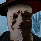
Your use of light here and color is very intuitive and immediately meaningful. The bright colors around the clown's head is a great use of irony as the white head seems to pop out and deny that the color exists, the head also being very solid vs. the scattering of the colors not having a real attachment, looking as if though they made fade or drop off at any moment, or a breeze. The deep shadows plus the body posture is perfectly rendered. In particular, the elongated hand hanging pulls us down even farther, as if gravity were X2.
A very effectual piece.
Right, exactly. That's why I put my sarcastic disclaimer there at the end. :) And I did get that, what your painting was actually about, and that's why I said what I did...because people generally don't see the big picture. Got it.
Sure thing, thank you!
Ha ha, yes, well thanks for that, but it's the Altamira platform that will not allow a "no price" amount, so if you want something on here to not be for sale, then you have to put at least one dollar as an amount. You can't just put NFS, not for sale. They don't have that choice. Why? DK. Changes are slow sometimes.
But thank you nonetheless!
I am simply dying to give someone some online lessons, practically for free. Do you know anyone that is interested?